
STORE OPTIMIZATION

How to Improve Shopify Mobile Shopping Experience.
The
rise of mobile commerce has reshaped the way people shop online. In
2025, more than 70% of online purchases are expected to come from smartphones
and tablets. If your Shopify store isn’t optimized for mobile, you could be
losing more than half of your potential customers before they even finish
browsing.
Mobile
optimization isn’t just about having a responsive theme. It’s about creating a seamless, fast, and enjoyable mobile
shopping experience that encourages visitors to stay, explore,
and convert into buyers. From page load speed to intuitive navigation, every
detail matters. We’ll explore practical, step-by-step strategies to improve
Shopify’s mobile shopping experience, covering design, performance, checkout, SEO, and UX best practices.

Meanwhile,
the way customers shop online has changed forever. A few years ago, most
eCommerce purchases happened on desktop. But today, mobile devices dominate.
According to Statista, over 70%
of all eCommerce sales this year comes from smartphones and the
number keeps climbing.

For Shopify merchants, this shift presents both a massive opportunity and a serious challenge. If your store isn’t designed to perform flawlessly on mobile, you risk frustrating visitors, losing sales, and falling behind competitors who have already embraced a mobile-first strategy.
Think
about it: how many times have you tried to shop on your phone, only to abandon
the cart because the site was slow, the buttons were too small, or the checkout
process felt like an obstacle course? Your customers feel the same way. The
truth is, today’s mobile shoppers have zero patience for friction.
They expect a smooth, fast, and intuitive shopping journey from browsing
products to making payment in just a few taps.
This
is where Shopify mobile
optimization comes in. It’s not just about having a responsive
theme that “shrinks” to fit smaller screens. Mobile optimization means redesigning your store’s entire shopping experience with
mobile users in mind: faster load times, touch-friendly navigation, simplified
checkout, and layouts that make browsing easy and enjoyable.

In
this guide, we’ll break down step-by-step
strategies you can implement to transform your Shopify store
into a mobile powerhouse. Whether you’re a new store owner or an experienced
merchant, these tips will help you increase conversions, improve customer
satisfaction, and future-proof your business in an increasingly mobile-first
world.
1.
Why Mobile Optimization Matters for Shopify Stores
·
User
behavior: Most
customers browse on mobile before deciding to buy.
·
Google
ranking:
Mobile-first indexing means your store’s mobile version impacts your SEO.
·
Conversions: Mobile shoppers abandon carts faster
if the site is slow or clunky.
Stat:
A 1-second delay in mobile load time can reduce conversions by up to 20%.
2.
Optimize Page Load Speed
Speed
is the foundation of a great mobile shopping experience.
Action
steps:
· Compress
and resize images using Shopify apps like TinyIMG or Crush.pics.
·
Minimize
unused apps and scripts that slow down mobile performance.
·
Use
Shopify’s built-in
content delivery network (CDN).
·
Enable
lazy loading so images load only when users scroll to them.
Tip: Test your mobile speed with Google PageSpeed Insights
and aim for a score of 85+.
3.
Use a Mobile-Responsive Shopify Theme
Not
all Shopify themes are equal. Some are beautifully optimized for desktop but
fail on mobile.
Checklist
for mobile-friendly themes:
·
Clear,
large CTA (call-to-action) buttons.
·
Easy-to-read
fonts and consistent spacing.
·
Touch-friendly
menus and navigation.
·
Minimalist
design with fewer distractions.
Recommended
Shopify themes: Dawn,
Impulse, Motion, and Prestige.
4.
Simplify Navigation and Search
Mobile
shoppers need to find products quickly. Complex menus or hidden categories lead
to frustration.
Best
practices:
·
Use
a sticky navigation bar
that follows the shopper as they scroll.
·
Add
a prominent search bar
at the top of every page.
·
Use
predictive search to help users find products faster.
·
Keep
menus short with collapsible sections.
5.
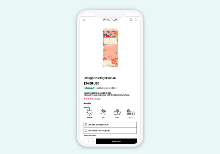
Optimize Product Pages for Mobile
Product
pages are the decision-making hub. They need to load quickly and display
essential details upfront.
What
to include above the fold on mobile:
·
Product
images (optimized for zoom & swipe).
·
Price
and clear CTA button.
·
Key
benefits in short bullet points.
Enhancements:
·
Enable
360-degree product views
or videos for mobile-friendly demos.
·
Add
sticky “Add to Cart”
buttons so customers don’t need to scroll back up.
6.
Streamline Checkout for Mobile
Complicated
checkout is the #1 reason for cart abandonment on mobile.
Fixes
for Shopify checkout:
·
Enable
Shop Pay
for faster one-tap checkout.
·
Offer
alternative payment options like PayPal,
Apple Pay, and Google Pay.
·
Auto-fill
forms for shipping and billing.
·
Reduce
checkout to as few steps as possible.
Stat: Stores using Shop Pay see up to 18%
higher conversion rates on mobile.
7.
Optimize Images and Media for Mobile SEO
Images
that look perfect on desktop may slow down or break layouts on mobile.
Mobile
optimization steps:
·
Use
WebP format
for lightweight images.
·
Ensure
product videos are responsive and autoplay is disabled for mobile.
·
Add
alt text with keywords like “Shopify mobile optimization” for SEO.
8.
Leverage Push Notifications and Mobile-Friendly Popups
Instead
of annoying desktop-style popups, use mobile-optimized engagement tools.
Examples:
·
Exit-intent
popups offering
a discount before leaving.
·
Push
notifications
for flash sales and restocks.
·
Slide-in
popups that
don’t block the whole screen.
9.
Prioritize Mobile-First UX Design
Think
“mobile-first” instead of “desktop-first.”
UX
strategies:
·
Bigger,
thumb-friendly buttons.
·
Use
vertical scrolling
layouts rather than wide grids.
·
Avoid
heavy text blocks so use collapsible content sections.
·
Keep
Call to Actions (CTAs) clear and above the fold.
10.
Test, Track, and Improve Continuously
Mobile
optimization isn’t one-time it’s ongoing.
Tools
to test mobile Shopify stores:
·
Google
Mobile-Friendly Test
·
Hotjar
(heatmaps to track clicks and scrolls)
·
Shopify
Analytics (mobile conversion tracking)
Conclusion
Shopify mobile optimization is no longer optional it’s essential. With most shoppers coming from smartphones, your store’s mobile experience could be the difference between a booming business and a struggling one.
By
improving page speed,
navigation, product pages, checkout, and overall UX, you can
dramatically boost conversions and customer satisfaction. Add continuous
testing and updates, and you’ll ensure your Shopify store is always aligned
with the evolving demands of mobile shoppers.
In
short: the better your mobile shopping experience, the higher your conversions,
sales, and long-term growth.
The
next steps for you do take is to apply these optimizations to your Shopify
store today, test results with mobile-specific analytics and combine strategies
like Shopify Image Optimization and Checkout
Optimization
for maximum results.
At
the end of the day, Shopify mobile optimization isn’t just a technical upgrade it’s
a business growth
strategy. Every second your store takes to load, every extra
click in your checkout process, and every confusing navigation link directly
impacts your revenue. Customers have endless options online, and the stores
that win are those that provide a frictionless, enjoyable mobile
shopping experience.
By
applying the strategies in this guide, you’re not only fixing pain
points—you’re building trust, encouraging repeat purchases, and creating a
brand that feels modern and customer-focused. From optimizing product pages to
streamlining checkout and ensuring your site runs lightning-fast, each
improvement adds up to a smoother journey for your
customers and more sales for you.
But remember: optimization is never finished.
Mobile technology evolves, user behavior shifts, and competitors adapt. That’s
why the best Shopify merchants continuously test, track, and refine their
stores. Use tools like Hotjar, Shopify Analytics, and Google’s Mobile-Friendly
Test to monitor how visitors interact with your site and spot new opportunities
for improvement.
If
you commit to making mobile your top
priority, you’ll not only reduce cart abandonment but also
unlock higher conversion rates, stronger SEO rankings, and a loyal customer base
that loves shopping with you anytime, anywhere.
However, the question isn’t whether mobile
optimization is worth it. The question is: how much revenue are you leaving on the table if you
don’t optimize now?
Frequently Asked
Questions (FAQ) about Shopify Mobile Optimization
1. Why is mobile optimization so
important for Shopify stores?
Mobile optimization is crucial because over 70% of eCommerce sales now come
from mobile devices. If your Shopify store isn’t mobile-friendly, visitors may
abandon your site due to slow load times, poor navigation, or frustrating
checkout processes leading to lost sales.
2. How can I test if my Shopify store
is mobile-friendly?
You can use tools like Google’s
Mobile-Friendly Test, PageSpeed
Insights, and Shopify’s built-in analytics to check performance. These
tools will show you how your site appears on different devices and highlight
areas that need improvement.
3. Does using a responsive Shopify
theme guarantee mobile optimization?
Not necessarily. While responsive themes adjust layouts for smaller screens,
true mobile optimization requires faster
load times, touch-friendly buttons, simplified menus, and a streamlined
checkout. Responsive design is just the starting point.
4. What’s the biggest reason for mobile
cart abandonment?
The top reason is a complicated or lengthy checkout process. Other major
factors include slow loading speed, unexpected shipping costs, and lack of
trust signals (like security badges or clear return policies).
5. How do images affect mobile
optimization on Shopify?
Large, uncompressed images can drastically slow down mobile performance. Always
compress and resize images using apps like TinyIMG or Crush.pics. Use
WebP format where possible, and ensure product photos load quickly without
losing quality.
6. What apps can help improve mobile
experience on Shopify?
Popular apps for mobile optimization include:
- AMP
by Shop Sheriff:
for lightning-fast product pages
- PageFly: for custom,
mobile-optimized layouts
- TinyIMG: for image
compression and SEO
- Tapcart: to create a
mobile shopping app for your store
7. How often should I optimize my
Shopify store for mobile?
Mobile optimization is not a one-time task. You should review your site’s
performance quarterly or whenever you make significant changes (like
switching themes, adding apps, or updating product catalogs).
Are you now ready to level up your Shopify store? bookmark this tab and apply what you've learnt. Check back for more real and working tips for your Shopify store, Comment and follow us by submitting your email for any new articles that will help your ecommerce business grow. Thank you.


0 Comments
We are happy to see your feedback